Skip to content

Portfolio

Business systems and websites.

Explore agentic workflows, ERP, CRM and warehouse systems, alongside live client websites.

Explore our work

What would you like to explore?

Live client websites and working software concepts you can try for yourself.

Interactive software concepts

Working software concepts with fictional data. Explore their menus, change a record and see how the pieces connect.

Agentic systems

Supplier recommendationInteractive concept · Fictional data · Simulated agents
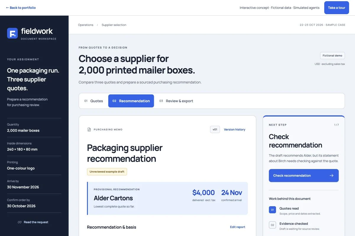
Three fictional supplier quotes become a sourced recommendation. Review an unsupported claim, add a simulated supplier reply and compare the updated report before human review.
Supplier recommendation

Interactive concept · Fictional data · Simulated agents

From supplier quotes to a clear recommendation.

Compare costs and delivery dates, resolve missing information, and prepare a report with its sources attached. Follow an operations manager choosing a supplier for 2,000 printed mailer boxes.

  • Compare itemized costs and delivery dates
  • Check claims against the quoted evidence
  • Keep unknown freight and arrival dates visible

ERP systems

Business ERPInteractive concept · Sample data
Inspect a stock risk, check the sources and prepare a purchase draft.
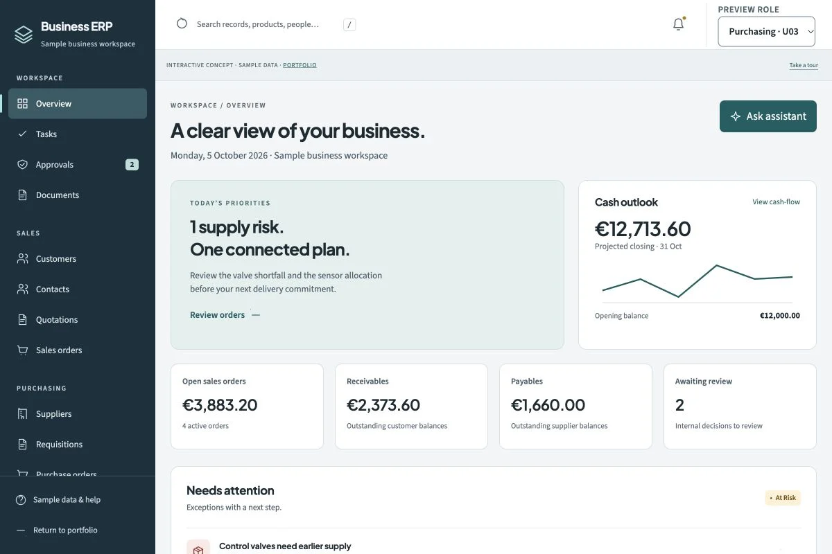
Business ERP

Interactive concept · Sample data

Business ERP with an embedded assistant

Sales, purchasing and finance share one working picture. Review the assistant’s sources before turning a suggestion into a draft.

  • Sales & customer records
  • Purchasing & approvals
  • Site inventory & movements

CRM systems

Furniture studioInteractive concept · Sample data
Compare materials, revise a quote and see exactly what changed.
Furniture studio

Interactive concept · Sample data

Furniture & kitchen studio CRM

From the first enquiry to a considered quote. Keep dimensions, finishes, revisions and installation plans together.

  • Enquiries & customers
  • Projects & verified dimensions
  • Materials & quote revisions

Warehouse & fulfilment systems

WarehouseInteractive concept · Sample data
Resolve a picking shortage and follow the stock movement.
Warehouse

Interactive concept · Sample data

Warehouse & fulfilment

Follow stock through the building. Receive, allocate, pick and dispatch, with a clear path through the exceptions.

  • Receiving & putaway
  • Inventory, locations & lots
  • Orders & reservations

Changes stay in this browser. Connections, assistants and agents are simulated; no real orders, messages or payments are sent.

Client websites

Websites we built. Live, right now.

Real homepages, captured from the live sites. Hover a screen to scroll through it, or open the site and click around yourself.Client websites, ready to explore. Watch a short walkthrough or open the live site.

Website walkthrough
Visit the website ↗
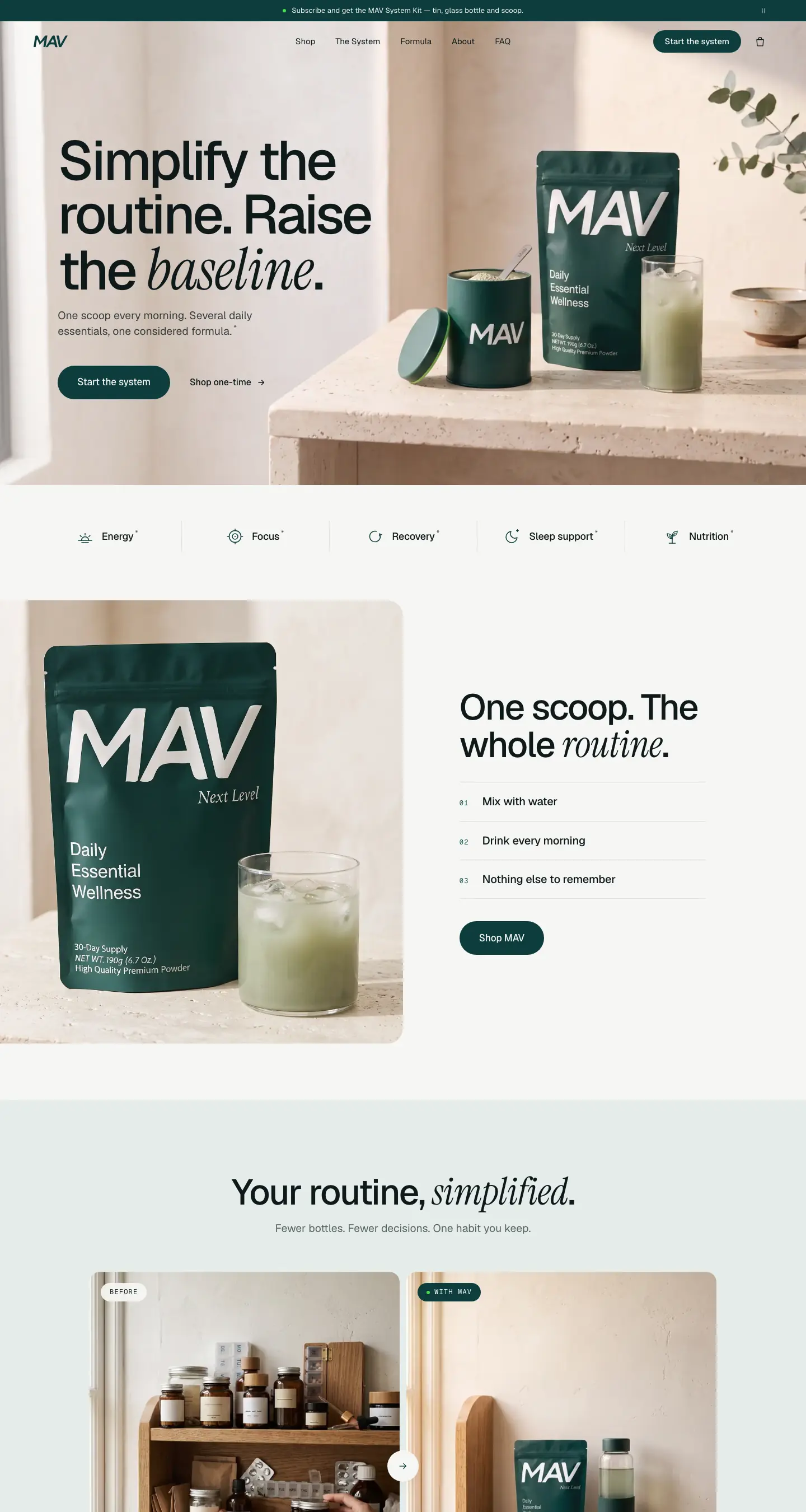
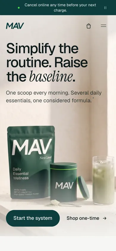
Homepage of MAV, captured from drinkmav.com (opens in a new tab) MAV homepage on a phone
01 / 1001 / 08

Wellness · Direct-to-consumer

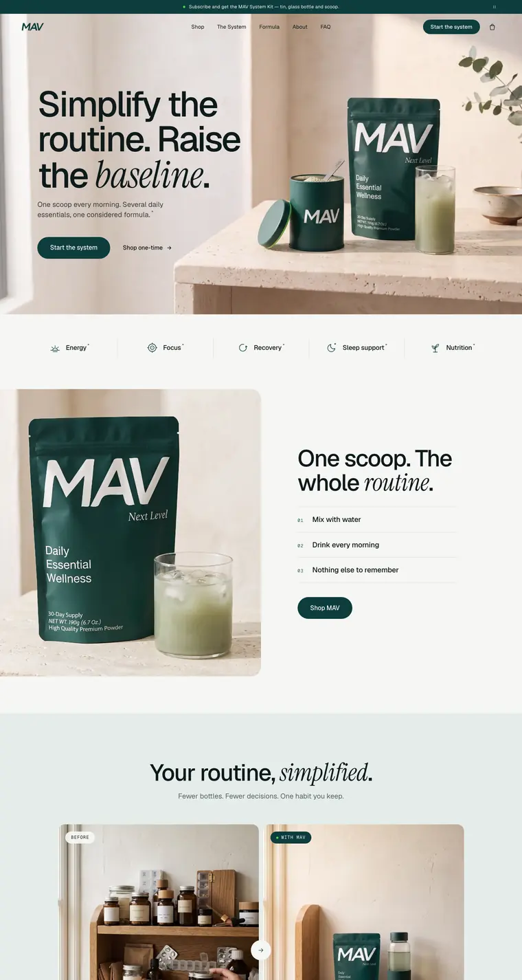
MAV

The starting point
Explain a daily wellness formula without overwhelming the buyer.
What we built
Clear formula pages, product imagery and a side-by-side choice of one-time purchase or subscription.
  • Brand storefront
  • Product imagery
  • Subscription flow

Built with Next.js · React · TypeScript · Cloudflare

Client feedback · approved paraphraseDenis, Founder, MAV

We had the product and a clear feeling for the brand, but no idea how to put it on a screen. They got it straight away. The site is calm and premium, it explains the formula without burying people in detail, and the imagery makes MAV look like a brand that has been on shelves for years. The first thing everyone says when they see it is that we look a lot bigger than we are.

Project scope and outcomes

The starting point

MAV is one product doing the job of a whole shelf of supplements. That is a hard story to tell on a screen. Say too little and it reads like another green powder; say too much and the page turns into a lab report. The brand had to feel premium and trustworthy from the first scroll.

What we built

  • A media-first homepage that sells the morning routine, with a before-and-after story of the shelf it replaces
  • A product page with gallery, lightbox and the one-time or subscription choice side by side
  • System and Formula pages that explain the routine and the ingredients in plain language
  • A full set of packaging and lifestyle renders, so the brand looked finished before the first photoshoot
  • Fast static pages on Cloudflare, structured to plug straight into Shopify checkout

How we approached it

Sold the habit first: one scoop, every morning, nothing else to remember.

Kept the science readable. Benefits up front, the detail one tap deeper for anyone who wants it.

Used a quiet palette and generous space so the product reads premium and never loud.

What changed

  • 2× conversion rate after launch, from 3% to 6%
  • Premium from the first scroll
  • Clear science, no hype
Website walkthrough
Visit the website ↗
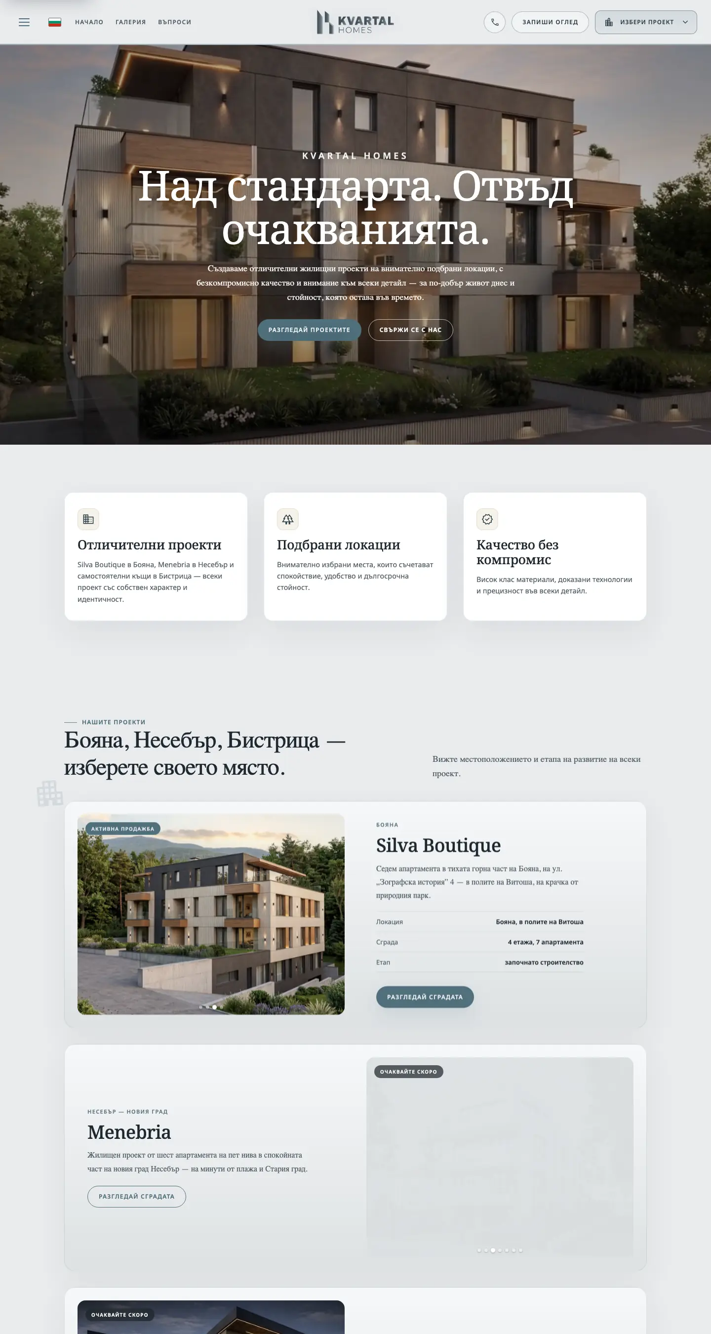
Homepage of Kvartal Homes, captured from kvartalhomes.bg (opens in a new tab) Kvartal Homes homepage on a phone
02 / 1002 / 08

Real estate · Listings

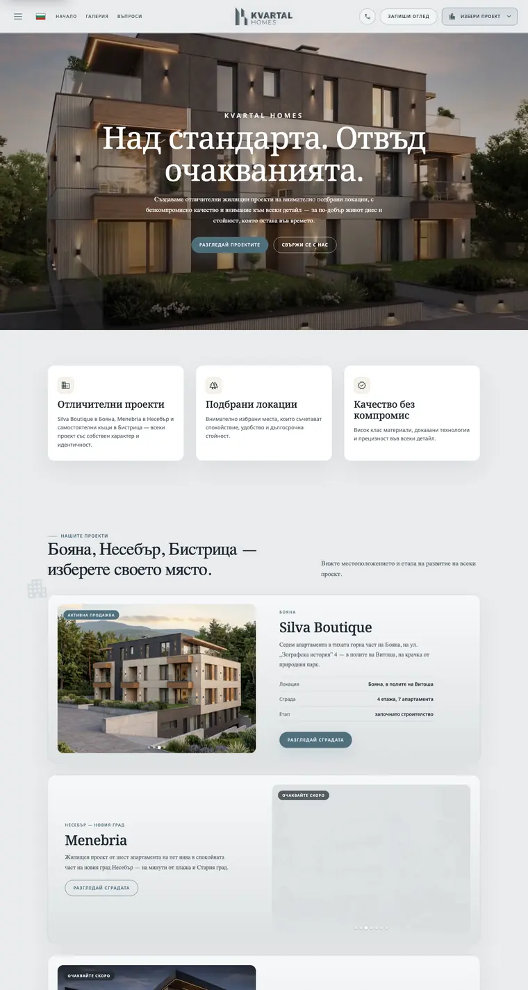
Kvartal Homes

The starting point
Help property buyers find the right home and take the next step.
What we built
Fast property pages, mobile browsing and a clear route to enquiries and viewings.
  • Bespoke website
  • Property listings
  • Enquiry flows

Built with Next.js · React

Client feedback · approved paraphraseTodor, Owner, Kvartal Homes

The whole process was fast and refreshingly structured — they never made us chase down information, just asked for exactly what they needed and ran with it. We gave a few small directions and otherwise watched them deliver; it was genuinely hands-off, and we loved how readily they worked to what we wanted.

Project scope and outcomes

The starting point

Property buyers are quick to judge and quicker to leave. A generic listings page loses them before the right home ever surfaces — and a lost browser is a lost viewing, not just a lost click.

What we built

  • A bespoke listings experience designed around the path to a viewing
  • Clear, fast property pages that answer the obvious questions up front
  • Enquiry and booking flows that make the next step effortless
  • Mobile-first throughout — most browsing happens on a phone

How we approached it

Designed for intent: surface the right homes fast and remove every reason to bounce.

Made enquiry the natural next click, not a buried form.

Built bespoke — no recognisable template — so the brand reads as credible.

What changed

  • Booked viewings, not bounces
  • Bespoke build, not a template
  • Mobile first, end to end
03 / 1003 / 08

Wellness · Theta Chamber studio

Creating The Future You

The starting point
Sell the Theta Chamber to investors while keeping studio bookings simple.
What we built
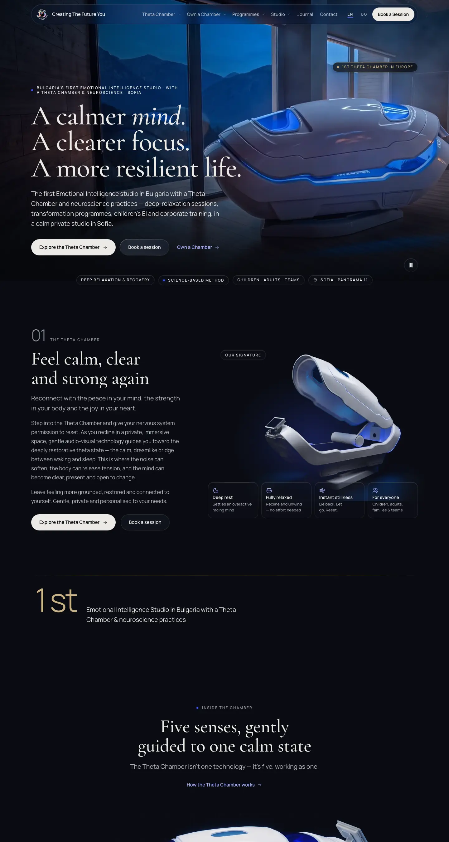
A cinematic bilingual site, Cal.com booking, franchise pages with an ROI calculator and every old Wix link redirected.
  • Bilingual website
  • Online booking
  • Franchise & ROI pages

Built with HTML · CSS · JavaScript · GSAP · WebGL · Cloudflare · Cal.com

Project scope and outcomes

The starting point

Creating The Future You is Bulgaria's first Emotional Intelligence studio with a Theta Chamber and neuroscience practices, in Sofia. Its bookings, intake forms and 128 blog posts all lived on Wix. The studio's ambition had also grown: beyond filling its own sessions, it wanted to sell the Theta Chamber itself to studio owners and investors across Europe. The new site had to present the machine like a premium product, keep booking a session simple, and leave Wix without losing a single old link.

What we built

  • A dark, cinematic design that puts the Theta Chamber centre stage, with films of the chamber and a live WebGL background
  • 28 pages in English and a full Bulgarian version: the chamber and how it works, every programme, the team, reviews and FAQ
  • Online booking on Cal.com, connected to the studio's Google Calendar, in place of the Wix booking pages
  • An Own a Chamber section with franchise and investor pages and an ROI calculator for prospective owners
  • All 128 Wix blog posts moved over with their images, and a 301 redirect for every old Wix address
  • Fast, accessible pages, checked one by one with Lighthouse before launch and hosted on Cloudflare

How we approached it

Made the machine the hero: the chamber on a dark stage first, the Sofia studio as proof that it works, owning one as the next step.

Kept two doors open on every page: book a session, or own a chamber.

Kept the language to wellness and relaxation, never medical treatment, because the chamber is not a medical device under EU rules.

What changed

  • EN + BG the full site in both languages
  • Online booking into the studio calendar
  • Every old Wix link redirected
Website walkthrough
Visit the website ↗
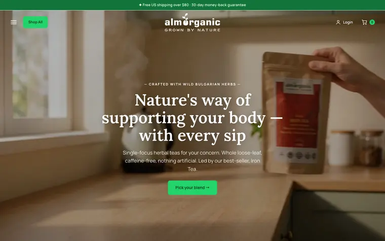
Homepage of AlmOrganic, captured from almorganic.com (opens in a new tab) AlmOrganic homepage on a phone
04 / 1004 / 08

E-commerce · Organic

AlmOrganic

The starting point
Bring new buyers to a store that relied on word of mouth.
What we built
A faster storefront, search-focused content and tracking around repeat purchases.
  • Storefront
  • SEO
  • Content program
Client feedback · approved paraphraseMartin, Co-Owner & Operations Manager, AlmOrganic

Our whole business is online, so conversion rate is everything — and they improved ours significantly. Their input on the marketing and on presenting our products built us a whole new sales funnel, and the return on what we invested in the site has been excellent.

Project scope and outcomes

The starting point

A natural-products brand with loyal customers but a site that wasn't pulling its weight. Discovery was thin, the store leaned on word of mouth, and there was no content engine bringing new buyers in on its own.

What we built

  • A cleaner, faster storefront built around repeat purchase
  • An SEO foundation targeting the terms real buyers actually search
  • An ongoing content program that earns traffic and trust
  • Analytics and conversion tracking to see what's working

How we approached it

Treated the website as the first step of marketing — fix the destination, then drive to it.

Layered SEO and content so traffic compounds instead of resetting each month.

Optimised the path to repeat orders, where the real lifetime value lives.

What changed

  • ~2–3× revenue, compounding
  • Repeat orders, steady
  • Organic traffic that compounds
Website walkthrough
Visit the website ↗
Homepage of Aquerus, captured from aquerus.com (opens in a new tab) Aquerus homepage on a phone
05 / 1005 / 08

E-commerce · Bathroom wellness

Aquerus

The starting point
Explain filtration, compatibility and cartridge changes without making the product feel complicated.
What we built
A bilingual storefront with clear product comparison, system guidance and refill paths.
  • E-commerce storefront
  • Product education
  • Bilingual BG / EN
Project scope and outcomes

The starting point

A filtered shower system asks buyers to understand filtration, compatibility and cartridge changes before they choose a finish or add a kit to their cart. The website had to carry that technical story without making an everyday bathroom product feel complicated.

What we built

  • A bilingual Bulgarian and English storefront for the shower-head kits, finishes and replacement cartridges
  • A product-led homepage that explains the three filtration stages, standard G1/2 fit and cartridge replacement cycle
  • Clear routes into product comparison, compatibility, installation guidance and the water quiz
  • Refill-plan, FAQ and cart journeys that keep ownership information close to the buying path

How we approached it

Started with the product in use, then placed the technical details beside the decisions they support.

Used comparison and short explanations to make the system understandable before asking for a purchase.

Kept the same product hierarchy and shopping path across Bulgarian and English.

What changed

  • Clear product education
  • Bilingual Bulgarian and English
  • Complete shop-to-refill journey
06 / 1006 / 08

Hospitality · Beach hotel

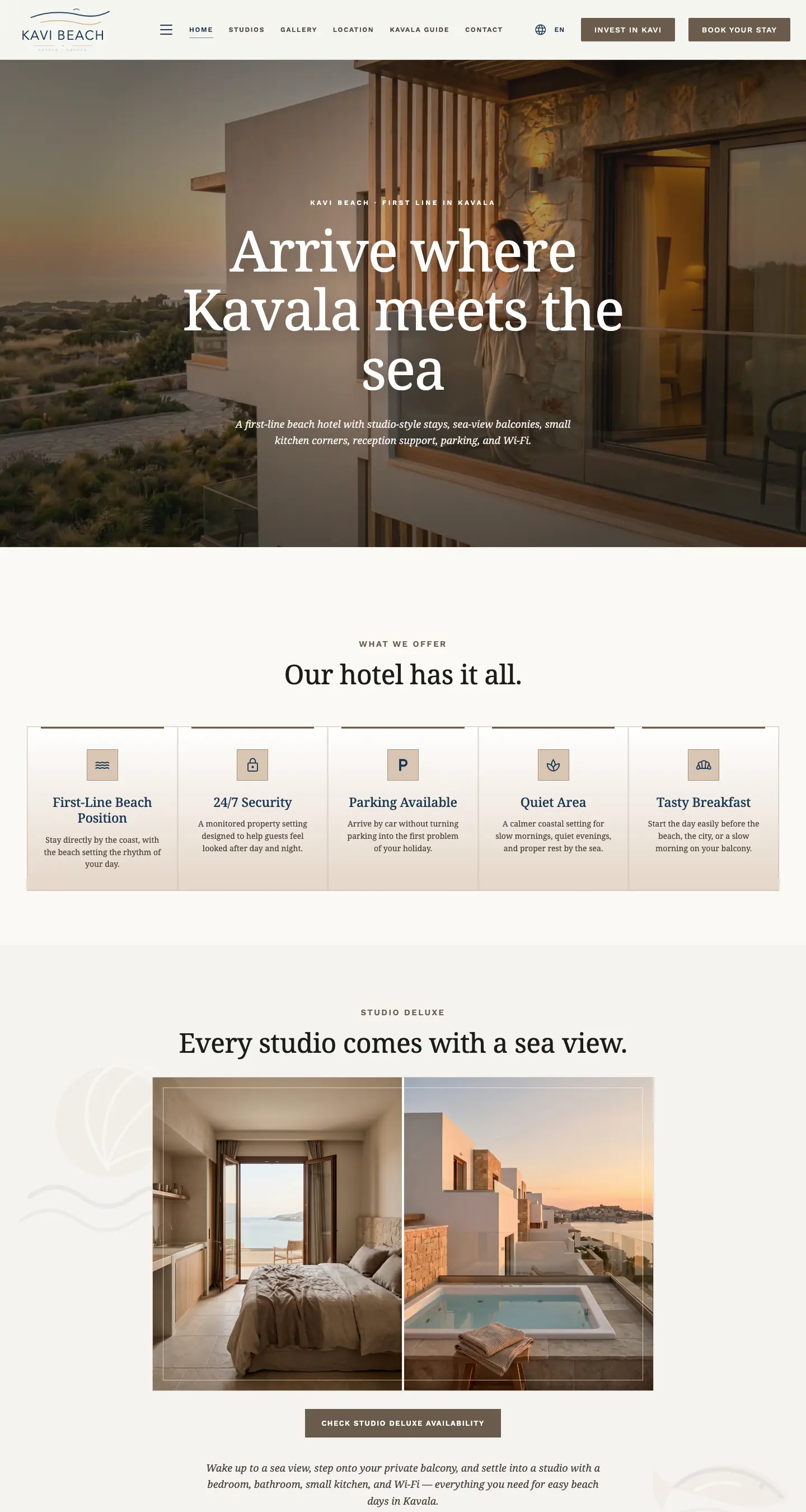
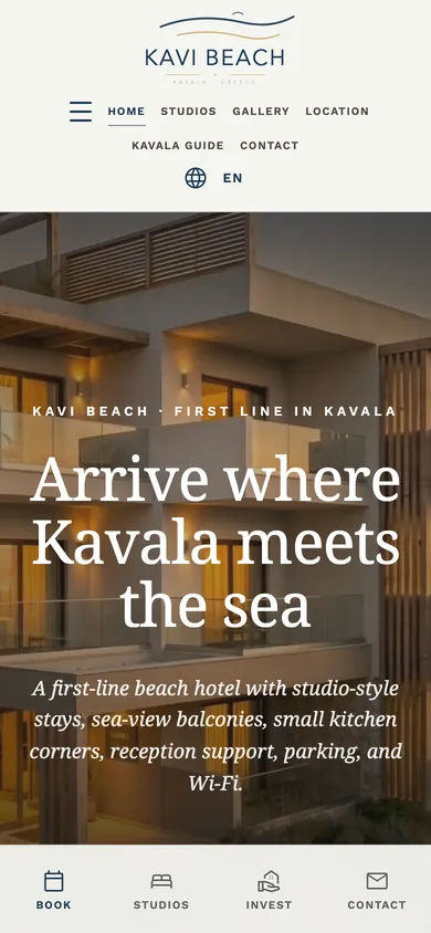
Kavi Beach

The starting point
A beach hotel website was speaking to investors rather than guests.
What we built
An opening film, sea-view studio pages and practical guides for Bulgarian and Turkish travellers.
  • Hotel website
  • Opening film
  • Multilingual guides

Built with HTML · CSS · JavaScript · Cloudflare

Client feedback · approved paraphraseValery, Owner, Kavi Beach

A hotel sells a feeling before it sells a room, and they got that from the first meeting. The opening film alone makes you want to be in Kavala. What surprised me was how much thought went into the practical side too: parking, the beach, how to get here, separate guides for our Bulgarian and Turkish guests. It answers the questions people ask before they book. Honestly the best-looking hotel site on our part of the coast.

Project scope and outcomes

The starting point

Kavi Beach sits on the first line of the beach in Kavala, but its old web presence spoke to property investors rather than holidaymakers. Guests coming from Bulgaria and Turkey had nothing written for them. The new site had to make people want to stay before they ever looked at a price.

What we built

  • A cinematic opening film of the property for the homepage hero
  • Studio pages with sea-view galleries and a clear path to checking availability
  • The practical pages guests look for before booking: location, parking, policies, FAQ and a Kavala guide
  • Dedicated guides for Bulgarian and Turkish travellers, with the investor story kept on its own page
  • Search landing pages for beach hotel, sea-view and studio stays in Kavala

How we approached it

Led with the feeling: sea, light and balconies first, the details after.

Answered the questions guests ask before booking right on the page.

Kept holidaymakers and investors on separate paths so each gets the right story.

What changed

  • Cinematic opening, made in-house
  • Multilingual guest journeys
  • Booking one tap from every page
Homepage of DDC Devices, captured from ddcdevices.com (opens in a new tab) DDC Devices homepage on a phone
07 / 1000 / 08

Medical devices · Catalog

DDC Devices

The starting point
Make a specialist device range easy to understand and compare.
What we built
A custom catalog with clear specifications, product pages and a foundation for search.
  • Custom storefront
  • Product catalog
  • SEO foundations

Built with Next.js · React

Client feedback · approved paraphraseDaniela, Owner, DDC Devices

The difference is night and day. We saw results as soon as the new website went live, and it is exactly how I wanted it. They moved fast and still nailed the hard part: presenting highly scientific products in a way that's clear and credible.

Project scope and outcomes

The starting point

Specialist medical devices live or die on trust. A clunky or generic catalogue makes a serious product range feel unserious — and makes it hard for the right buyer to explore and commit.

What we built

  • A custom storefront that makes a technical range easy to explore
  • Product pages structured for clarity, specs, and confident buying
  • A clean, trustworthy design that reads as credible at first glance
  • Performance and SEO foundations ready for launch

How we approached it

Led with credibility — the design has to earn trust before the spec sheet does.

Structured the catalogue so a specialist buyer finds and compares fast.

Built launch-ready, with room to grow the range without a rebuild.

What changed

  • Immediate results after launch
  • Custom storefront, not a template
  • Clear specs, easy to buy
Website walkthrough
Visit the website ↗
Homepage of Celluma, captured from celluma.bg (opens in a new tab) Celluma homepage on a phone
08 / 1007 / 08

E-commerce · Skincare devices

Celluma

The starting point
An LED-therapy store was losing visitors before checkout.
What we built
A rebuilt buying path, clear product education, checkout and conversion tracking.
  • Conversion-first rebuild
  • Product copy
  • Paid campaigns

Built with WordPress · WooCommerce

Client feedback · approved paraphraseElisaveta, Owner, Celluma Bulgaria

I'd worked with agencies before and always felt ripped off — paying a fortune for average results. VoxTraffic is the first that does everything to a high standard without me ever having to push for it, and they took the marketing and copywriting off my plate so I could focus on the business. Since the new site went live, our sales have jumped.

Project scope and outcomes

The starting point

An LED light-therapy shop with a great product and almost nothing to show for it — roughly two sales in its entire history. The store looked the part but never made the case, so traffic that did arrive bounced before it ever reached checkout.

What we built

  • A conversion-first rebuild centred on a single, obvious path to buy
  • Product pages that explain the science in plain language and sell the outcome
  • Mobile-first layout, fast load, and SEO foundations baked in
  • Checkout and tracking wired up so every order and ad click is measurable
How we approached it

Started from the buyer, not the catalogue — what someone needs to believe before they spend on a device.

Rebuilt the funnel around that decision, then fed it qualified paid traffic.

Tested creative and landing variants weekly, doubling down on what converted.

What changed

  • Weekly orders, from ~2 ever
  • Paid traffic, now profitable

  • Mobile checkout, built to convert
Website walkthrough
Visit the website ↗
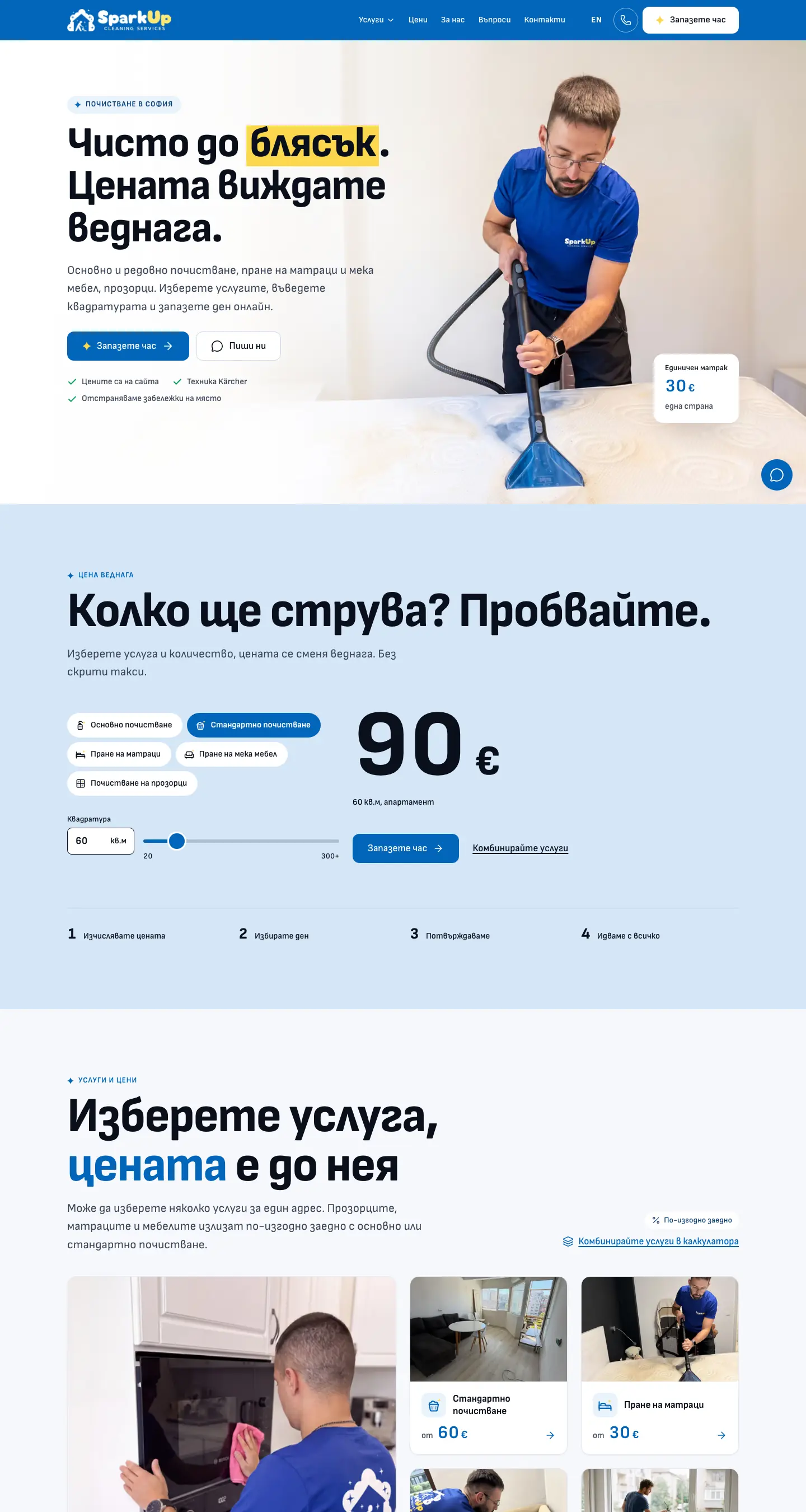
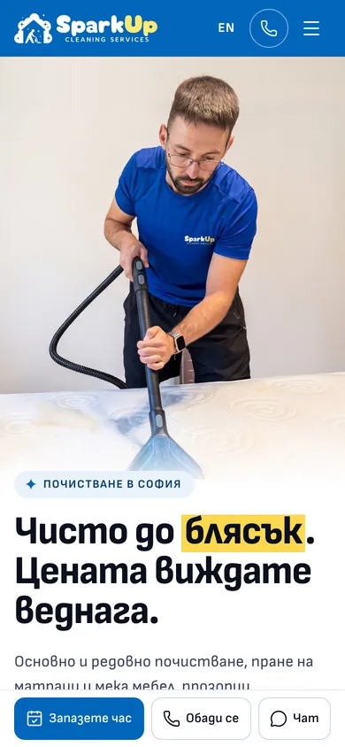
Homepage of SparkUp, captured from sparkup.bg (opens in a new tab) SparkUp homepage on a phone
09 / 1008 / 08

Home services · Cleaning

SparkUp

The starting point
Show a cleaning price instantly and turn it into a booked visit on a phone.
What we built
A live price calculator, online booking straight into the company calendar and tracked QR codes for flyers.
  • Booking website
  • Live price calculator
  • QR codes for print

Built with Astro · React · TypeScript · Cloudflare

Project scope and outcomes

The starting point

SparkUp is a young cleaning company in Sofia. People who need a deep clean, a mattress washed or the windows done want two answers before anything else: what will it cost, and when can you come. The site had to give both on a phone, turn the answer into a booked visit, and give the company's printed flyers somewhere to send people.

What we built

  • A live price calculator for all five home services: choose the service, enter the size or quantity, see the final price in euros
  • Online booking that offers the open time slots and lands straight in the company's Google Calendar, with no third-party booking tool in between
  • Service pages for deep and standard cleaning, mattress and upholstery washing and windows, priced from the same source as the calculator
  • A separate page for businesses, with a direct request form instead of the calculator
  • Permanent QR codes for flyers and stickers, each one tracked through to the visits and bookings it brings in
  • Bulgarian and English versions, a Google Business Profile and structured data for local and AI search

How we approached it

Put the price first: the number visitors came for sits right under the hero and changes as they type.

Designed for the phone first, because flyer and QR visitors arrive on one.

Used real photos of the crew at work, so a new company looks like people you can trust in your home.

What changed

  • Live price for every home service
  • Online booking into the company calendar
  • Tracked QR codes for print
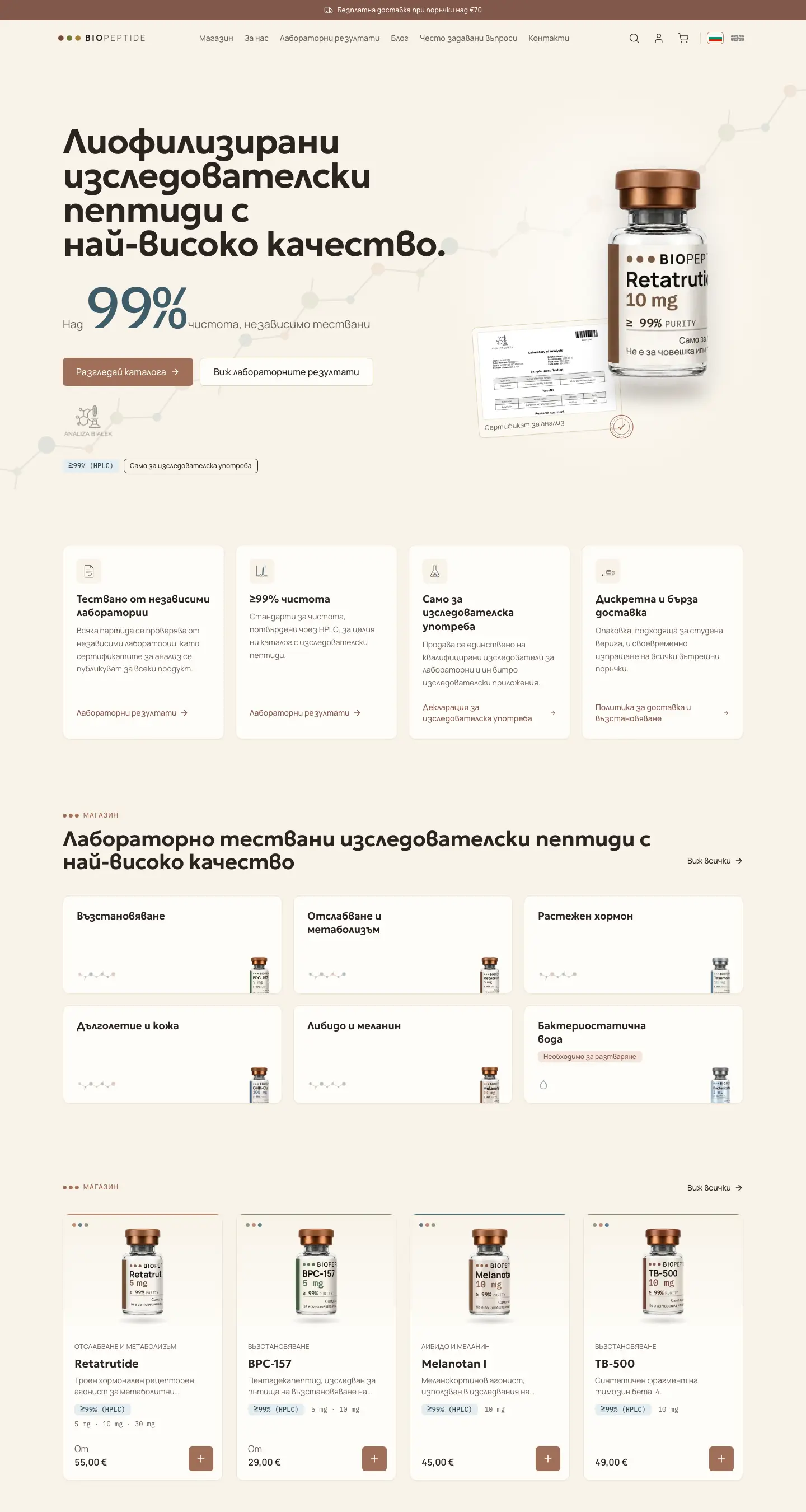
Homepage of BioPeptide, captured from biopeptide.bg (opens in a new tab) BioPeptide homepage on a phone
10 / 1000 / 08

E-commerce · Research peptides

BioPeptide

The starting point
Give technical buyers the product evidence they need before ordering.
What we built
A bilingual shop, detailed specifications and a library of downloadable lab certificates.
  • Custom Next.js shop
  • Bilingual BG / EN
  • SEO & science content

Built with Next.js · React

Client feedback · approved paraphraseAlex, Founder, BioPeptide

From the first call to launch, I've been very impressed with the speed and efficiency of the entire process.

Project scope and outcomes

The starting point

Research peptides sell to a careful, technical audience. Buyers want purity data, full specifications and strict research-use compliance before they trust a supplier, and a generic shop template can't carry that detail or that restraint.

What we built

  • A custom Next.js shop in Bulgarian and English, with catalog, cart and checkout
  • Product pages that show purity, CAS number, formula, molecular weight and storage at a glance
  • A lab-results library with downloadable certificates of analysis
  • SEO foundations and a science-notes blog structured for a research audience

How we approached it

Led with evidence: purity, specifications and testing method sit next to every product, with certificates one click away.

Kept the tone clinical and compliant, with research-use-only notices built into the journey.

Built it bilingual, so Bulgarian and English buyers get the same depth.

What changed

  • Fast from first call to launch
  • Bilingual shop, Bulgarian and English
  • Lab-backed specs and certificates

Website previews recorded from the live sites between September and November 2026.

Your project

Building a system or a website?

Tell us how your business works and what you want to build. A real person replies within one business day.

Discuss your project